It’s no secret that when someone is looking to buy a product, they are likely analyzing more than one option. So, how do you best communicate your product and company strengths in a way that stands out and connects with your buyers? The best way to build that rapport with a potential customer is to be as transparent as possible, and position yourself as a better option than your competitors in a non-biased way. The first opportunity you have to do this is through your website, and in particular, your product pages.
Your product page is where you can give site visitors the best information about how you can solve their problems and make their lives easier, by using your solution. You really want your product page to do its job - sell your product - and you also want to begin building your relationship with potential customers. Here are five elements that will help you build a product page that will help you stand out in your market.
Dynamic Product Visuals
Videos are the easiest way to showcase your product in a quick and effective way. If you can create a short two to three-minute clip, essentially an elevator pitch speaking to the value of your product, you can pull people in, right on your product page. In a way, you’re giving users a product demo without them feeling obligated to give you their contact information. Plus, videos are often more impactful than simple product screenshots.
Elevate your product marketing strategy with this free kit >>
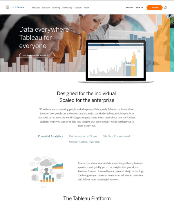
A great example of this is from Tableau, an interactive data visualization software company. They host a video right in the header of their product page. It’s just over two minutes long, which is the perfect length to give visitors an overview of the product, while also not taking too much of their time. This dynamic product visualization will likely resonate with visitors more than a product screenshot because it’s more of a product experience than a simple text explanation.
A Form
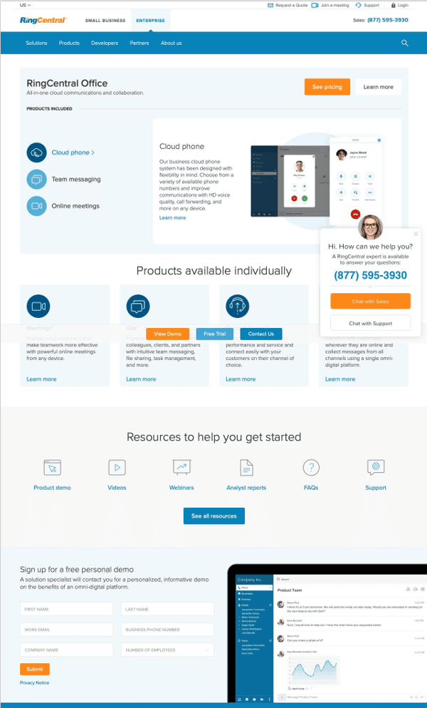
Visitors are on your page exploring your product because they have a problem, and want to know how your product can solve the problem and benefit their day-to-day. As you know, many people want answers fast. If you don’t have a video on your product page, the next best thing is a demo request form. Visitors want to see the product and learn its value as soon as possible. That’s why it can be extremely beneficial to have a form right on your product page. That way, visitors can request a demo as they continue reading about your product.
Take, for example, RingCentral, an enterprise cloud communications company. If you scroll down on their product page, you’ll see a demo form. Since it’s quick and easy, a visitor can fill out all of their information to get their personalized demo. Plus, RingCentral provides links to all of their resources right next to the demo form, so users can browse additional resources while they wait to hear from their RingCentral sales rep.
Testimonials
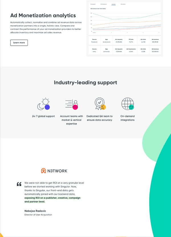
One way to prove the value of your product is to have case studies or testimonials on your website. Not only can you capture the journey and success stories of your customers, but you can use their strongest quotes to prove your value across your website. While it’s great to have sections on your website for longer case studies, throwing a testimonial or two onto your product page can give a prospect that extra push, with the help of positive feedback, to become a customer.
Singular, a marketing campaign insights company, leverages their existing customers on their own product pages. Take, for example, their Marketing Analytics product page. They take the visitor through the product using screenshots and calling out the most valuable pieces of their product. But, once you scroll down, you see a quote from one of their customers calling out the value that the product has offered to them and their company. As someone learns more about your product, they may want to know who uses it or what results have been like for customers. By adding in that small testimonial, you can provide visitors with that right on your product page.
Pricing
Rather than having a separate pricing page from your product page, include your pricing right on the page. This allows users to not only get all of the information they need about your product in one place, but they can also understand your pricing and plan options. Many companies, especially companies that cater toward enterprise businesses, don’t share their pricing online. Maybe your competitors aren’t sharing their pricing publicly, but this gives you an opportunity to be fully transparent with the ins and outs of your product.
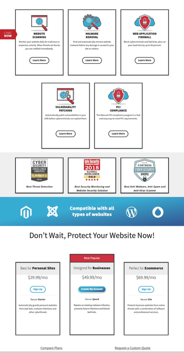
SiteLock, a cybersecurity company, has a robust product offering. With all that they’re able to do, pricing is sure to be the first question for many prospects. Right on their product page, they list their pricing tiers with a one-click sign-up option, within the pricing table.
A Chat Bot
As previously mentioned, everyone’s time is valuable, and everyone wants answers fast. No one wants to sit on hold on the phone or wait for their email to be answered. Which is why we’ve noticed a rise in chatbots on every website. Chatbots are especially valuable on product pages because if someone has a specific question, wants to set up a demo, or just wants to talk to a sales rep, they have to power to ask right then and there, and get an answer instantly.
While it’s tough to choose one great example of a chatbot on a product page, as most sites use these now, we can recommend some tools. Using a tool such as HubSpot or Drift can transform your static product page to an instantly interactive research experience for site visitors.
Incorporating some, or all, of these elements, will transform your product page to have a positive user experience, and help position you as the best option against your competition.

Seeing is believing! Check out Crayon for yourself.
Take a Product TourRelated Blog Posts
Popular Posts
-
 The 8 Free Market Research Tools and Resources You Need to Know
-
 6 Competitive Advantage Examples From the Real World
-
 How to Create a Competitive Matrix (Step-by-Step Guide With Examples + Free Templates)
-
 24 Questions to Consider for Your Next SWOT Analysis
-
 How to Measure Product Launch Success: 12 KPIs You Should Be Tracking
