No one cares about the price of your product unless they’re interested in buying it.
(Or they're interested in gathering competitive intel. But we'll set that aside for now.)
Prospects who visit your pricing page, in other words, are high-intent prospects — they’re aware of their pain points (to some extent) and they’re on the hunt for a solution.
Translation: Your pricing page is extraordinarily important. Each visit is an opportunity to nudge a high-intent prospect even further down the funnel.
Let’s take a look at eight examples of SaaS pricing pages and discuss the tactics you can use to turn website traffic into recurring revenue at a higher rate than ever before.
Get the Guide to Competitive Intelligence for Product Marketers
The best SaaS pricing pages — 8 examples & tactics
We took a tour of eight SaaS companies' websites to see what they’re doing with their pricing pages. Each tactic we’ll discuss today is based on the output of these companies. As always, the list we’ve compiled is non-exhaustive. Leave a comment below if you’ve got any ideas of your own!
1. Prove your value (inspired by Gong)
There are times when the painfully obvious needs to be stated. This is one of those times.
Your prospects won’t buy your software unless they believe the returns will exceed the price. That’s why Gong has dedicated a slice of their pricing page to providing proof of ROI:
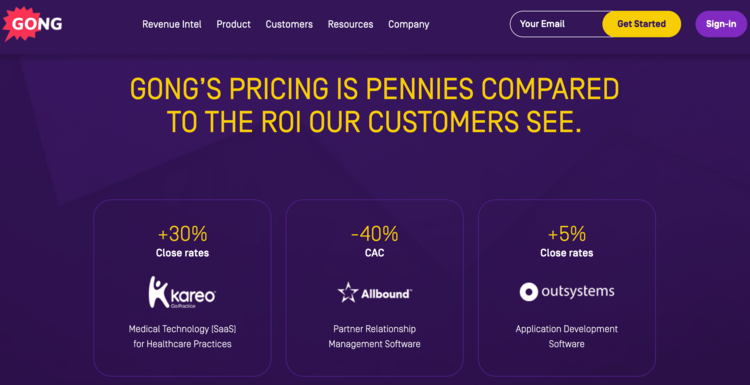
Bonus points to the Gong marketing team for including more than one ROI indicator. Everyone wants higher close rates and a lower customer acquisition cost (CAC), but different revenue leaders have different priorities — some care more about the former than they do about the latter. By including both indicators on their pricing page, the Gong team is able to speak to a wider range of prospective customers.
2. Establish a baseline (inspired by Gainsight)
As you skim through a pricing page and review the various options, it can be difficult to determine which features are included regardless of the package you buy. It can be difficult, in other words, to establish a baseline: What, at the bare minimum, will this product deliver?
This isn’t a problem you’d encounter if you were doing business with Gainsight:
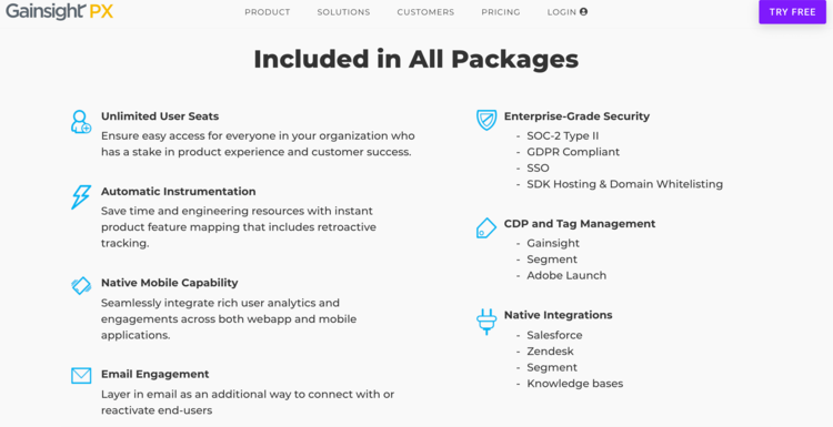
Of course, anyone who wants to dive into the details of each individual package has the option to do so; in fact, this will likely be necessary as you get closer to making a purchase decision.
Nevertheless, it’s important to cater to prospects who are simply getting a feel for the baseline features offered by each potential vendor. Fail to cater to these prospects and they may never return to your pricing page to take that closer look.
3. Provide a calculator (inspired by Mailchimp)
If the price of your product depends on the value of a specific variable — e.g., number of contacts, number of users, etc. — you should seriously consider implementing a calculator on your pricing page. High-intent prospects visit your pricing page with the objective of determining how much your product costs. You want to make it as easy as possible for them to complete this objective, and a simple calculator will go a long way towards this end.
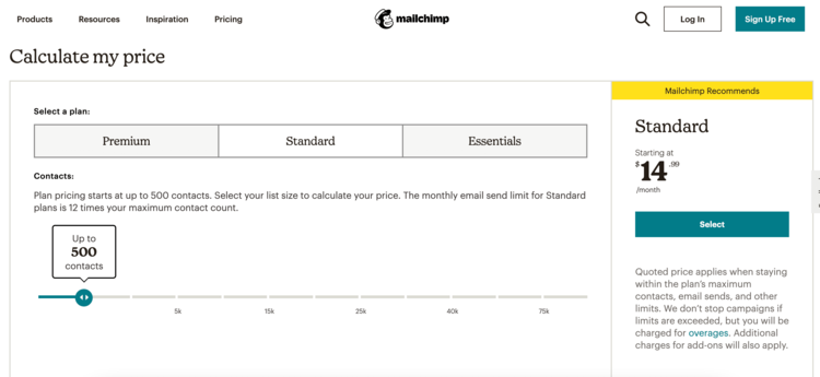
Mailchimp, consistent with their brand of simplifying digital marketing, have created the perfect example of a pricing page calculator. As a curious prospect, determining the price of your subscription is a two-step process: (1) select your package and (2) approximate the size of your contact list. Within seconds, you’ve got an almost exact estimate of what it will cost you to buy a monthly Mailchimp subscription.
4. Optimize your copy (inspired by ZoomInfo)
Hypothetically, let’s say you’re a marketer at a SaaS company called Compose. One of your tier one direct competitors — i.e., one of the rival companies that pops up in practically every single sales deal — is called WriteUp.
Question: If a high-intent prospect were to Google “how much does Compose cost,” what is the worst-case scenario?
Answer: A page from WriteUp’s website organically outranks your pricing page.
If prospects are using Google to find out how much your product costs — they probably are, to some extent — you need to do everything in your power to prevent your competitors’ websites from outranking your pricing page in the organic search results. Consider ZoomInfo:
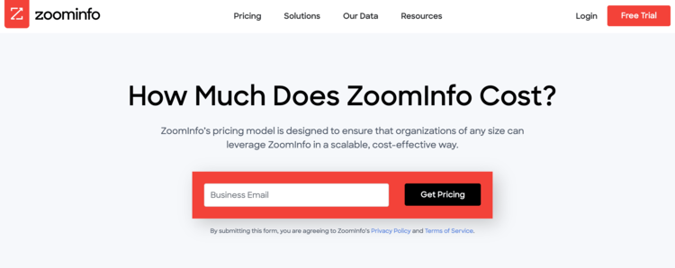
According to SEMrush, “how much does zoominfo cost” is searched more than 250 times per month in the U.S. alone — that’s a lot of high-intent prospects looking for the pricing page you see above! When the ZoomInfo marketing team optimized their H1 copy to rank for this extraordinarily important keyword, they took a big step towards preventing their competitors from stealing their traffic.
5. Implement a chatbot (inspired by HubSpot)
Sometimes, a prospect will visit your pricing page with a burning question that needs to be answered as quickly as possible — a question that can’t be answered with a calculator or an on-demand demo (more on this later). Because it’s risky to allow this prospect to leave your website with their question unanswered — what if they don’t come back? — it would behoove you to invest in a chatbot.
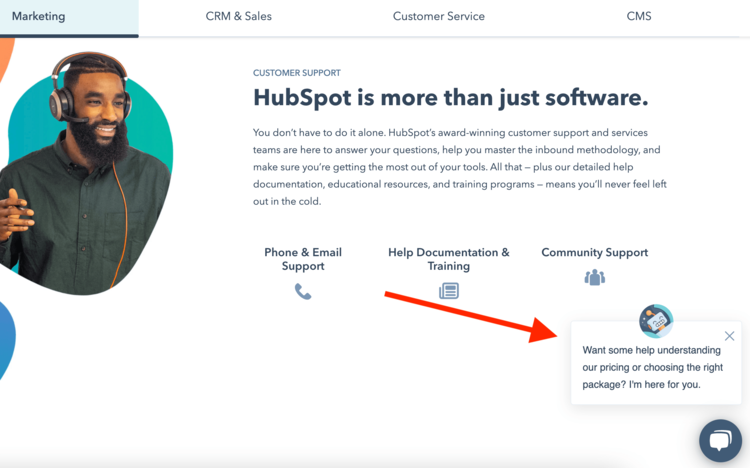
No SaaS company can produce pricing page content that answers every single question — not even HubSpot, home to some of the best marketers in the world. By offering a chatbot to their prospects, they’ve substantially reduced the risk of leaving questions unanswered. Chatbots are not free, of course, but they pay for themselves when you consider the revenue implications of a subpar pricing page experience.
6. Answer prospects’ FAQs (inspired by Zendesk)
Chatbots are valuable because they help to provide a good user experience to prospects with unique and/or tricky questions. But what about prospects with common questions? Does it make sense to force them to use a chatbot, a process that some folks would prefer to avoid?
No, it doesn’t. And that’s why your pricing page should include an FAQ section — to cater to prospects who need quick answers to straightforward questions.
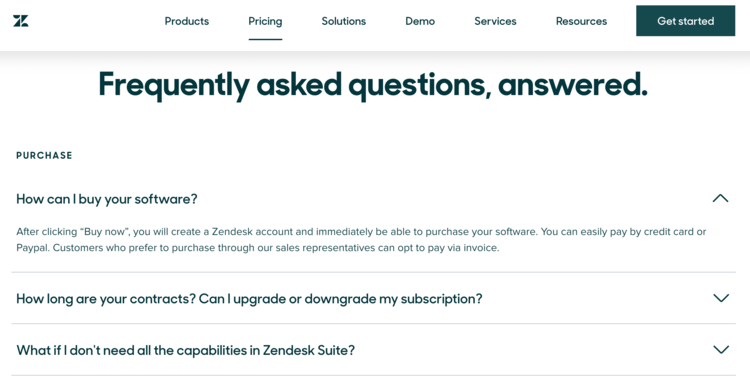
Zendesk does an excellent job of addressing FAQs with succinct, no-nonsense copy. And as you can see, these three FAQs are grouped underneath the word “purchase.” That’s because the Zendesk marketing team has segmented their pricing page FAQs into categories — a simple choice that goes a long way toward enhancing the user experience.
7. Describe each package (inspired by Wistia)
Pay a visit to your average SaaS pricing page and you’ll probably see names of different product packages (e.g., Free, Standard, Enterprise, etc.) accompanied by lists of features. As we’ve mentioned, these feature lists are important for prospects who need the nitty-gritty details as they approach a final purchase decision.
There’s a critical need, however, that cannot be satisfied with a list of features: the need for a story. If you want to make a positive impression on your prospects, you should write a brief description of each product package — a description that tells a story.
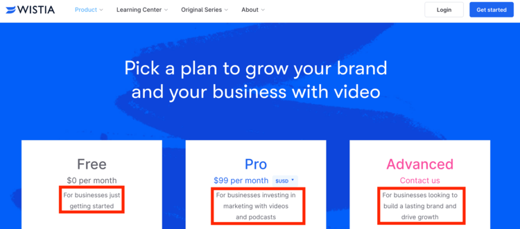
As you can see, Wistia tells a story with each of their three packages. The Free story is about a fledgling business that’s starting to experiment with video for the first time. The Pro story is about an established business that’s seen returns on their video investment and decided to double down. The Advanced story is about a market-leading business that’s striving to cement their video presence for years to come. With just a little bit of copy, Wistia’s marketers have turned a good pricing page into a great pricing page.
8. Animate product features (inspired by Smartsheet)
As powerful as it can be for late-stage prospects to see a bulleted list of features like “customizable user views” and “automated workflows,” an on-demand demo can multiply that impact several times over.
How? By bringing those features to life.
As a prospect, you may see the words “customizable user views” and think to yourself, “That sounds pretty cool.” But if you were to watch someone actually demonstrate the customization of their user views, there’s a chance you’d think to yourself, “I need that.”
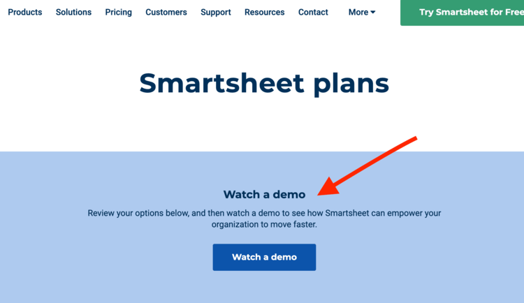
Smartsheet, as you can see, encourages their prospects to read first and watch second. This is brilliant, as (1) reading through features will inspire curiosity and (2) watching features come to life will inspire action. The marketers at Smartsheet know that their pricing page is appealing primarily to high-intent prospects, and they’re using an on-demand demo as a mechanism to nudge those prospects further down the funnel.
Learn from the best SaaS pricing pages
Does it make sense for every SaaS company to implement each of the eight tactics we’ve discussed here today? No, not necessarily. But there’s a reason we’ve discussed these eight tactics in particular: Each of them enables SaaS companies to provide better user experiences to their high-intent prospects.
At the end of the day, that’s what your pricing page is all about — effectively communicating critical information to people who have demonstrated a strong interest in your product.
If you can find a way to experiment with at least a few of these tactics, you’ll do just that.

Seeing is believing! Check out Crayon for yourself.
Take a Product TourRelated Blog Posts
Popular Posts
-
 The 8 Free Market Research Tools and Resources You Need to Know
-
 How to Create a Competitive Matrix (Step-by-Step Guide With Examples + Free Templates)
-
 6 Competitive Advantage Examples From the Real World
-
 24 Questions to Consider for Your Next SWOT Analysis
-
 How to Measure Product Launch Success: 12 KPIs You Should Be Tracking

