A competitive matrix is a visual resource that enables you and your colleagues to better understand your company’s position within the market—that is, to better understand how your company stacks up against the competition from a specific perspective.
From a specific perspective is included here for a reason: Although your company may be miles ahead of the competition in one respect, it may be relatively lackluster in another. For example, you may offer a suite of services to which none of your competitors can hold a candle. At the same time, your content marketing strategy may be amongst the weakest in your industry. You’re well-positioned against your competitors in one sense, but not so much in another.
Before we go any further, a note for those of you who prefer to watch rather than read: Everything covered in this blog post is also covered in this video!
Because there’s more than one way to assess your positioning relative to your competitors, it follows that there’s more than one way to create a competitive matrix. Indeed, as we’ll see in just a minute, competitive matrices come in all shapes and sizes.
In general, however, the purpose of creating any competitive matrix is to empower your colleagues with the insight they need to pursue improved positioning in the most effective ways possible. The purpose, in other words, is to help your colleagues identify opportunities and make good decisions.
Let’s walk through the process of creating simple competitive matrices in Microsoft Excel. Then, to wrap up, we’ll look at two examples of third-party competitive matrices.
How to create a competitive matrix in Microsoft Excel
By no stretch of the imagination am I an advanced user of Microsoft Excel. I can create basic formulas. I can make a bar graph look nice. On a good day, I can throw together a pivot table.
Luckily, you don’t need to be an Excel wizard to create a competitive matrix. Here are three examples of matrices that you can create on your own—along with step-by-step instructions. If you want to follow along with this post, you can download our competitive matrix template here.
DIY competitive matrix example: Marketing reach
With a marketing reach matrix, you and your colleagues can get a high-level sense of which companies are leading the conversation in your industry.
This helps not only with the identification of strengths, weaknesses, and opportunities, but also with the pursuit of differentiation. By determining which competitors have the loudest megaphones, you’re also determining which messages to which your audience is most often exposed. With this knowledge, your company is better equipped to say something unique.
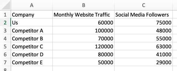
Open up a blank Excel spreadsheet, and in Column A, list your company and each of your competitors. In Column B, enter each company’s estimated monthly website traffic. (If your marketing team doesn’t subscribe to an SEO software solution, you can quickly sign up for a free trial with a tool like SpyFu.) In Column C, enter each company’s total number of social media followers.
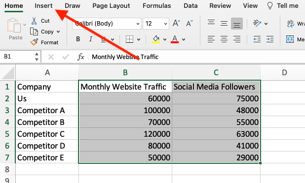
Highlight everything in Columns B and C, and navigate to the Insert tab.
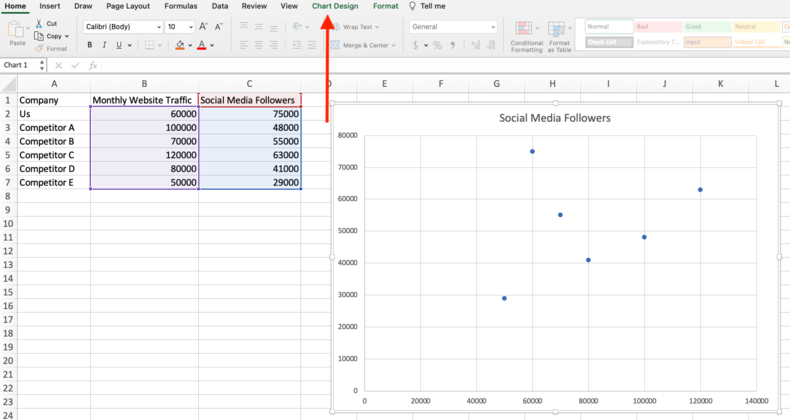
Create a scatter plot.

Excel will automatically generate an initial version of your competitive matrix. As you’ll notice—and as you can see below—we’ve got some work to do in terms of titles and labels. So, click on your matrix, and navigate to Chart Design.
On the far left-hand side, click Add Chart Element. From there, use Axis Titles and Chart Title to get everything in order. Label the x-axis with Monthly Website Traffic, label the y-axis with Social Media Followers, and make the title of the matrix Marketing Reach.
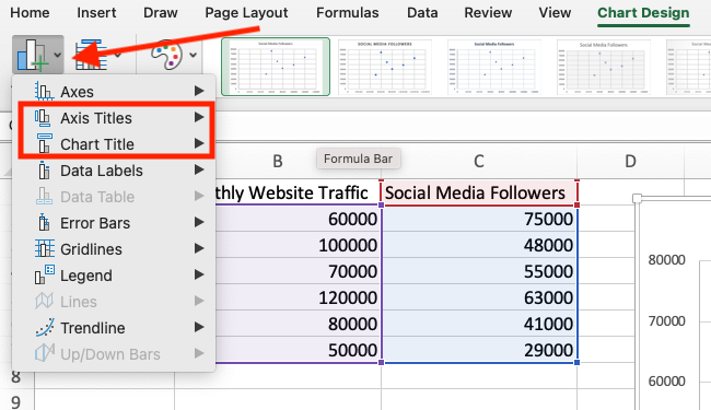

Now we’re getting somewhere! Next, head back to that same Add Chart Element drop-down menu, hover over Data Labels, and select More Data Label Options.
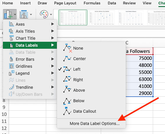
Uncheck the Y Value box, and check the Value From Cells box. When you’re prompted to select a data label range, highlight each of the companies listed in Column A.

Click the OK button, and voila—you’ve got yourself a competitive matrix! Depending on your preferences, you may want to use the Add Chart Element drop-down menu to remove the gridlines. Once you’ve cleaned up any little details like that, our final product is ready:

One takeaway here: Given that we’re leading the pack in terms of social media followers, we may want to focus on growing traffic to our website.
DIY competitive matrix example: Sales team performance
With a sales team performance matrix, you and your colleagues can see with which competitors you’re battling most fiercely for new customers.
If you’re a product marketer tasked with enabling sales reps to win deals, this knowledge is enormously valuable when it comes to establishing priorities.
The process of creating a sales team performance matrix is very similar—but not identical—to the process we just walked through. Open up a new Excel spreadsheet, and in Column A, list each of your competitors. (Don’t list your own company.) In Column B, enter your sales team’s win rate against each competitor. In Column C, enter the total number of opportunities your team has had against each competitor.
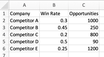
Follow the same steps as above to create a scatter plot. Once again, Excel will automatically generate an initial version of your matrix.
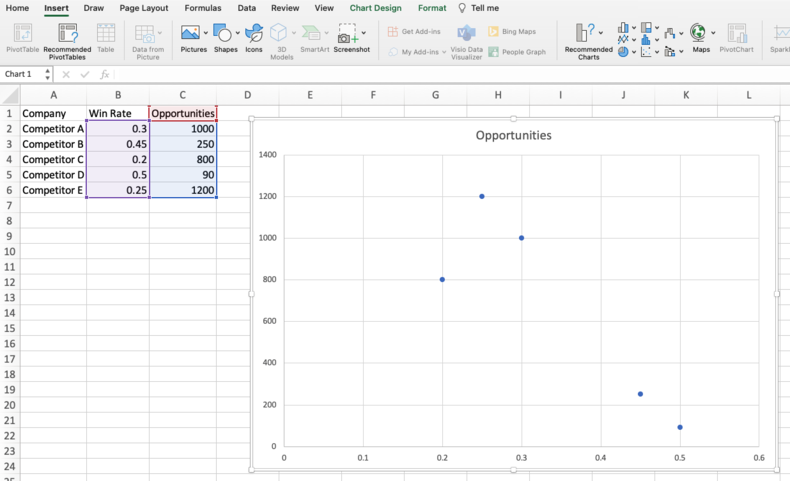
As before, we have work to do in terms of titles and labels. Follow the same steps as above to label your axes and create your title. Label the x-axis with Win Rate, label the y-axis with Opportunities, and make the title of the matrix Sales Team Performance.
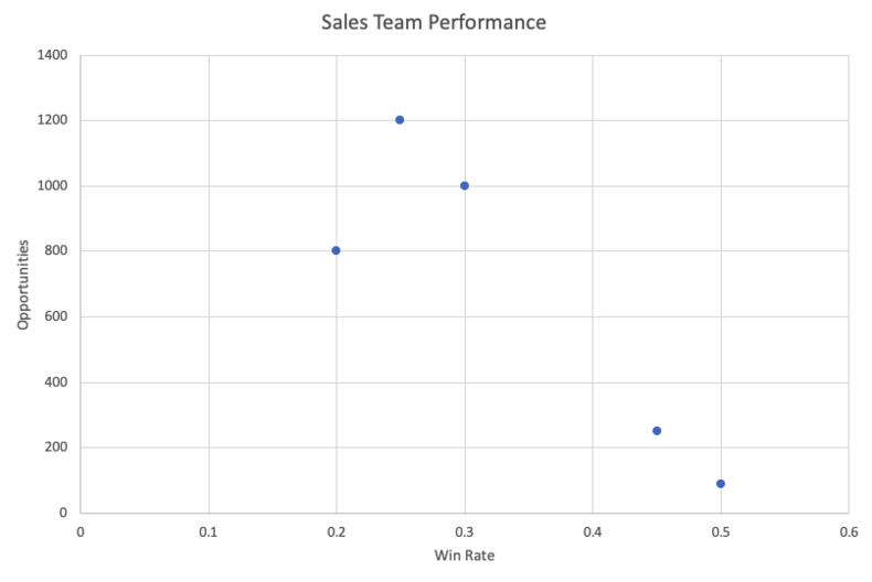
Follow the same steps as above to label each point on your matrix with the name of the corresponding competitor. And whereas our marketing reach matrix did not require the removal of the gridlines, this one does. Use the Add Chart Element drop-down menu to remove both the vertical and horizontal gridlines, and you should be left with something resembling this:
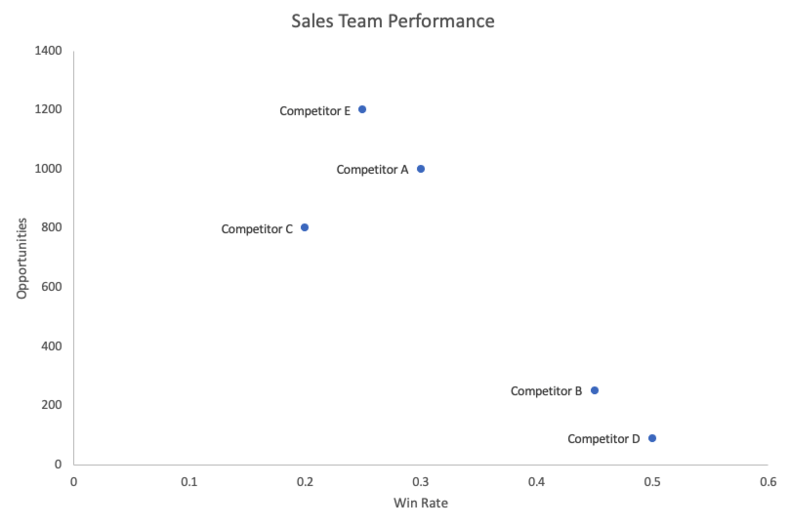
At this point, we’ve got a competitive matrix that looks very similar to our previous one. It’s in the last few steps that the difference becomes clear.
First things first: You need to set a threshold for both win rate and opportunity volume. There are a number of ways to go about this; for our purposes, we’re simply going to calculate the median value of each variable.
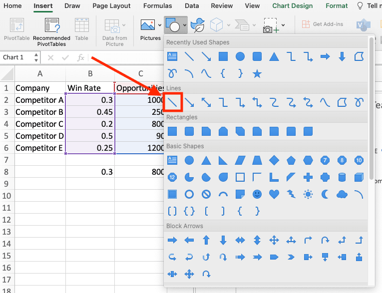
From our hypothetical data set, the median win rate is 0.3 and the median opportunity volume is 800. Accordingly, we’re going to insert a vertical line at 0.3 and a horizontal line at 800. This is done by clicking on the matrix and navigating to Insert. From there, click on the Shapes drop-down menu:
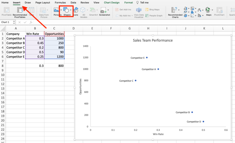
Select the plain line shape, and align it with your median win rate. Do the same with your median opportunity volume.
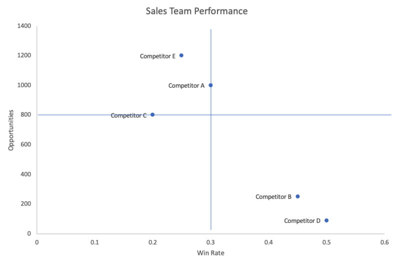
Now, our sales team performance matrix is divided into four quadrants: low win rate, low opportunity volume; low win rate, high opportunity volume; high win rate, low opportunity volume; and high win rate, high opportunity volume.
The last step in this process is labeling each quadrant with an appropriate (and memorable) name. Again, there are several ways to go about this—you can come up with whatever labels you like. For our purposes, we’re going to use Emergents, Rivals, Ankle Biters, and Contenders.
To do this, click on your matrix and navigate to Insert. Then, simply select Text Box from the far right-hand side and create a label for each quadrant.
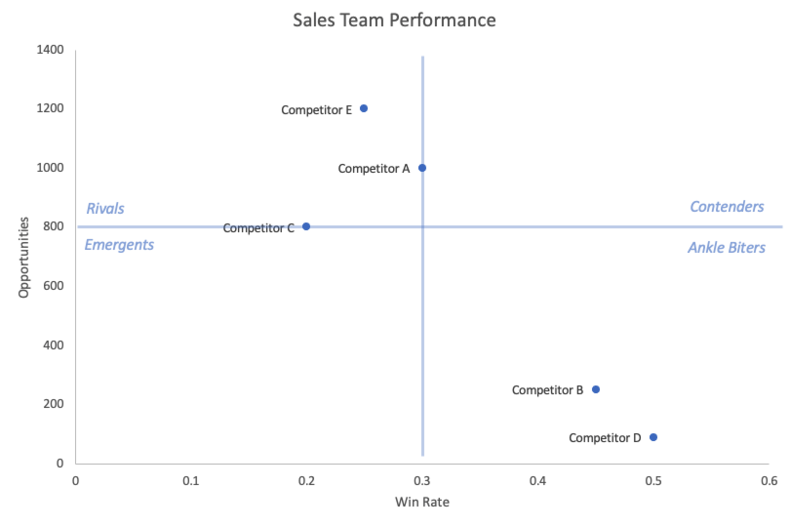
And there you have it! One takeaway here: From a sales enablement perspective, our primary focus should be Competitor E.
DIY competitive matrix example: Feature (or service) comparison
With a feature (or service) comparison matrix, you and your colleagues can see how your company’s offerings stack up to those of your competitors. I’ve included or service in parentheses because the process we’re about to walk through can be very easily applied to industries that are service-based rather than product-based.
This kind of competitive matrix is valuable to a number of stakeholder audiences across your organization. It can help your product team (or services team) prioritize action items on their roadmap. It can help your marketing team improve their messaging. It can help your sales team improve their competitive objection-handling. Best of all, out of the three DIY competitive matrices we’ve discussed here today, it’s by far the easiest to create in Excel.
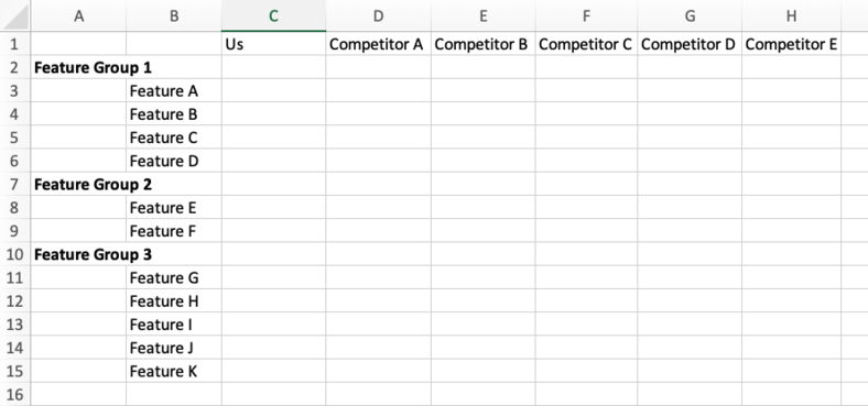
To begin, open up a new spreadsheet and, starting with Column C, list your own company and each of your competitors across Row 1. Then, starting with Row 2, use Columns A and B to list each feature of interest. Ideally, these features are grouped together like this:
Using your knowledge of your own company’s product and your competitors’ products—which most likely comes from a mix of field intelligence and user reviews—indicate whether each company is strong, weak, or absent for each feature. (“Absent” meaning the company does not offer the feature.) Use green for strong, yellow for weak, and red for absent.
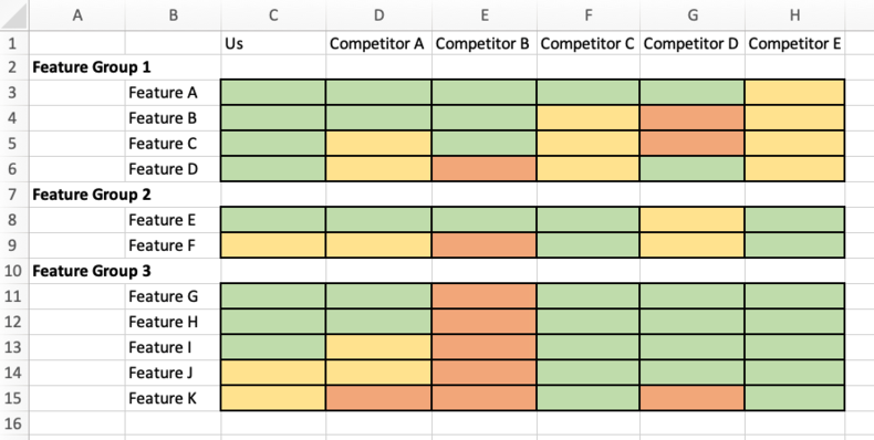
Just like that—we have a competitive matrix that’s going to make a world of difference to tons of folks around your organization. One takeaway here: We should train our sales reps to pivot conversations with prospects to Feature Group 1 whenever Competitor E is part of the equation.
Third-party competitive matrix examples
Third-party competitive matrices are often important to evaluate, as prospective customers may consult these grids before choosing a solution. Sites like Gartner and G2 gather their own inputs to determine the ranking of each company and, as such, provide additional detail that you may not otherwise gather in your analysis of the competitive landscape.
Gartner Magic Quadrant

Gartner’s Magic Quadrant plots each company by their Ability to execute and their Completeness of vision. The best-performing of both are Leaders, and the lowest-performing of both are Niche Players. The innovative solutions who have yet to execute are the Visionaries, and the execution-oriented but not-so-innovative companies are the Challengers.
This type of competitive matrix is helpful for uncovering which competitors are adapting with the market—the visionaries and leaders—so that you know who will remain or become dominant rivals in the future. This matrix can also help you discover which companies to research in regards to leveling up your execution skills: What are the company and product factors that lead to a company being named a Leader or a Challenger?
Comparative matrix from G2

G2’s comparative matrix plots each company by Market Presence and Customer Satisfaction. Companies with a large market presence and high customer satisfaction (based on reviews on their site) are deemed Leaders, while those with low presence and low satisfaction are designated Niche solutions. Contenders (large market presence, low satisfaction) and High Performers (low presence, high satisfaction) round out the grid.
This matrix is helpful for identifying the scale of each company’s reach and feedback from the market. If your company falls into the “High Performers” square, you know to focus your efforts on increasing awareness of your solution and leveraging your success with customer satisfaction.
Compare competitors seamlessly with Crayon’s free competitive matrix template
Although it isn’t difficult, per se, to create a competitive matrix with Microsoft Excel, it can be time-consuming. And if you’re already busy enough as it is—between conducting market research, creating message maps, updating sales collateral, and the like—then you may conclude that the juice isn’t worth the squeeze.
For a nearly instantaneous evaluation of you and all your competitors, check out Crayon’s free competitive matrix template. Whether you're interested in marketing reach, sales team performance, feature comparison, or all of the above, you can use our Excel template to quickly assess your positioning relative to the rest of the market.


